
‘A Hard Man is Good to Find!” 03March 2023 – 11 June 2023 Photographers Gallery, London W1.
I was looking forward to visit this exhibition partly because it received an enormous amount of press and the title is very provocative and draws you in. I was ultimately a bit disapointed as there wasn’t really a huge amount of work there and little variation.
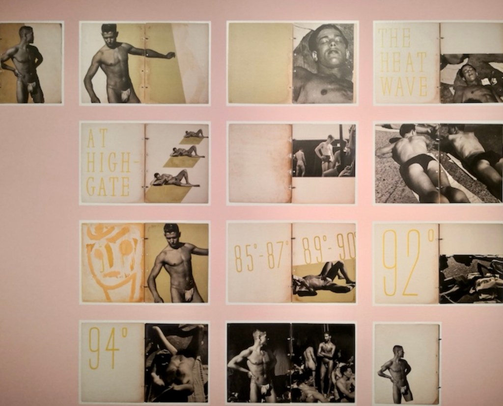
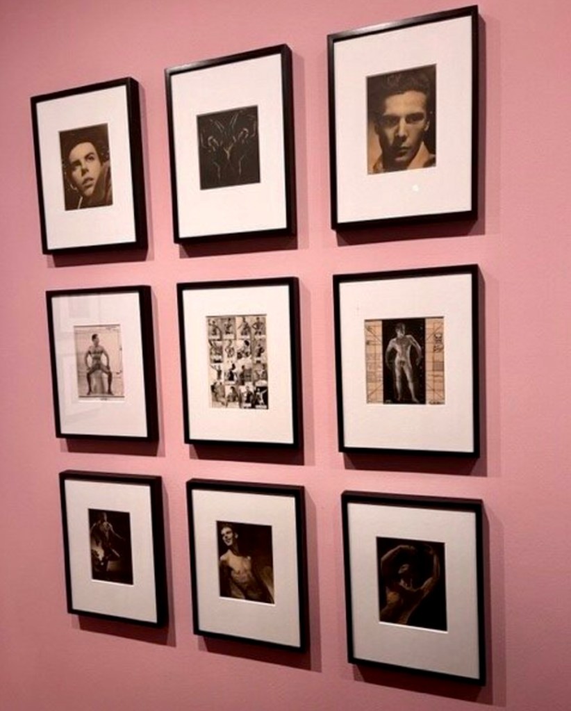
My favourite exhibit was a display of blown-up pages from a collage album put together by the artist Keith Vaughan. Photographs of sunbathing young guys at Highgate Men’s Pond in 1933 alongside graphic typography and a layout that feels like they could have come from a modern cool magazine


THEME:
Photographic exhibition that highlights areas of London which were a focus for gay men to gather and also to find other men to photograph. The show celebrates a clandestine visual culture of men’s bodies that emerged in the post war period during a time when making and distributing such images was a criminal offence.
PRESS RELEASE: There is a Press Release for this exhibition. It gives a clear outline of the the theme of the exhibition and includes the photographers who’s work is featured. It also lists the Curator and that is will be show alongside the Deutsche Borse Prize 2023. It goes on to give the Press and PR contacts for the gallery and then includes specific notes for editors on the gallery itself and short bio on the curator.
INVIGILATION: The works displayed are almost all photographs which are framed and securely hung on the walls. There are a couple of magazine displays which are under glass. There were no invigilators in this exhibition but I did notice that there were cameras in the two galleries of the show. I assume they were monitored by someone keeping an eye on the visitors. In exhibitions where there are invigilators, their job is to sit in the gallery and enforce any house rules like ‘no photography’, ‘no eating’, ‘don’t touch’ etc.
HEALTH & SAFETY: I couldn’t see any health and safety issues in this exhibition other than leaning to hard on the glass display cases for the magazines and potentially breaking them. There were no signs warning people of this but it would have been a very unlikely event. The gallery has a no eating and drinking policy so there were no potential spills of liquid on the floor.
TARGET AUDIENCE: Gallery members, photography lovers, people interested in a previously little documented world which many men were forced to hide within. The queer community.
FUNDING: This exhibition is funded by the gallery. The Photographer’s Gallery is a registered charity that has funding from the Arts Council but relies on membership subscriptions, patronage, corporate partnerships and legacies.
AGE CONSIDERATIONS: This exhibition contains nudity and therefore requires a warning to the public. At the ticket desk and also at the entrance of the show there is a sign which states; This exhibition contains photographs showing nudity and sexually suggestive scenes. There is no age restriction for visitors. We are leaving the decision to visit to the discretion of parents, guardians and carers.
CONTENT – ANYTHING OFFENSIVE? This is mentioned in the nudity warning by stating that some images are sexually suggestive.
CURATORIAL DECISIONS: The show is in two rooms and a small side room. The first room is painted pink with the side room painted yellow. I liked the pink colour as it has become a symbol for the queer community, signifying empowerment and self-identity. I felt rather than obvious choice, it highlighted the subject of the exhibition which showed a time when being gay was a criminal offence. The side room was painted bright yellow and was the only part of the show to feature anywhere other than London. It was a small section on Los Angeles and the bright yellow spilled out of the enclave like sunshine so it felt very ‘LA’ The second room is painted lavender. This made me wonder if it was a nod to the term ‘lavender marriage’ which was a male/female marriage undertaken to hide the sexual orientation of one or both partners. This from around the early 1900s when being gay was illegal and socially stigmatising. I liked how the work was grouped together – firstly the ‘military men’ and then the work from a photographer who had assembled images together creating a magazine. The information about the show was printed directly on the painted walls which was a really effective and looked simple but stylish.

LOGISTICS: The photos would need to be framed and carefully wrapped in order to protect the glass. The hanging process would require carefully measuring distances on the wall to make sure they were hung according to t he curator’s instructions. The magazines on display were old so they would need to be packed in acid free paper and handles gently as they are fragile from age.
Musee picasso, paris.

The directors of the Picasso Museum in Paris asked the iconic British designer, Paul Smith, to lead the artistic direction of an ambitious exhibition of the museum’s collection on the 50th anniversary of Picasso’s death. Paul Smith is know for his use of colour and his attention to eccentric details.
I bought a ticket to see this exhibition and was unsure what to expect and I wondered if it was just a bit of a publicity stunt but as soon as I walked into the first room, I was absolutely amazed.
Smith had decorated the rooms and painted the walls in a way I have never ever seen in a gallery. It was stunning.


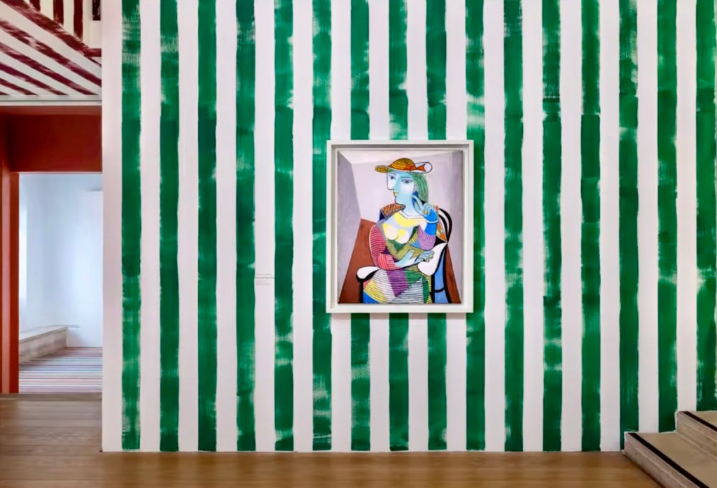


It gave the paintings and sculptures a new lease of life and everything felt new, fresh, alive. Personally, because I find Picasso’s images and style are so recognisable and iconic I didn’t feel the backgrounds overwhelmed them. It made me look more closely at them and I found I noticed colours in a way that I had not previously.
I loved how a collection of Breton stripe shirts were used in an installation that hung from the ceiling of a smaller room in the show. This iconic top is instantly recognisable as the shirt that Picasso favoured. Hanging them all from the ceiling allowed them to flutter in the breeze and your eye was drawn to look up at them. I liked how it made an ordinary room look so magical.


It was exciting to see such a bold way to showcase Picasso’s work. Many reviewers have savaged the exhibition calling it amongst other things “a disaster” and “catastrophic”. Reading the Musee’s publicity, they are honest about wanting to make Picasso relevant to a younger audiences saying they are responding to “the world of pop we are in now” where “everything is very immediate on people’s phones”. There is an extensive Press Kit for publicity that is available: https://www.museepicassoparis.fr/sites/default/files/2023-03/DP%20Paul%20Smith%20UK%202%2016.03.pdf
Conclusion: I can see why the Picasso purists might hate the way this show is curated and designed and I certainly wouldn’t want to see every exhibition hung on such bright and eclectic walls, but in this case I found it refreshing and unusual.
